So, yes.
I just said a small prayer. A little one. I have never done that in my life, not once, not seriously. And I did it right before opening a blank file to start the revamped brand and visual design for ZenMode.
That felt worth writing down. So here we are.
If there's a hook, why can't we unhook it?
That's ZenMode. Reverse engineered, hook-less. The unhooking is the product.
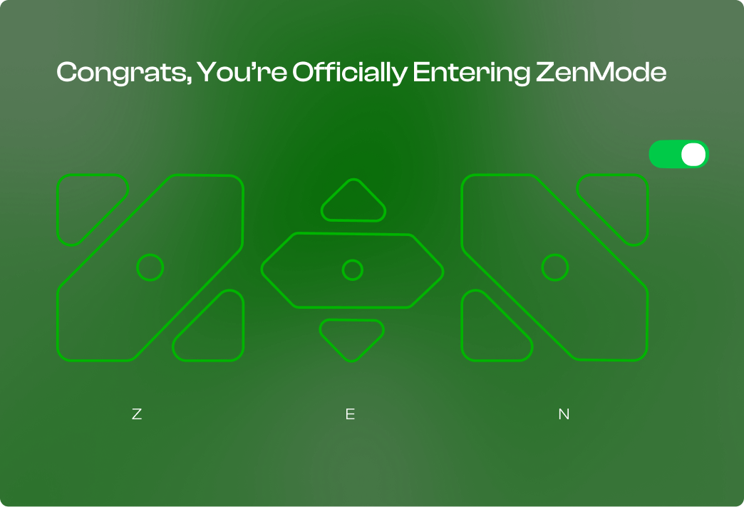
The story
Where ZenMode came from, what V1 actually was, and why a revamp instead of an update. Six notes, written in order.
What V1 actually was
ZenMode V1 was an ambiguous experiment. The idea was to bring the world's first real accountability layer to a launcher, you could see someone else's screen time, and they could see yours. The most widely perceived open secret in everyone's life, finally visible to one other person.
If you're single like me, don't worry. The universe had a plan for you too. One night, right as I was about to fall asleep, it whispered a crazy idea into my ear.
Random Connect
Pair a ZenMode user with another ZenMode user. No mutual friends, no social graph. Just a system that matches you with someone whose habits actually make you sharper, an accountability partner you never had to go ask for.
Srinivas built the matching system behind this. GitHub →

BTS
We started building ZenMode with one intention. Nothing more than that.
We met at FOSS United India in Bengaluru, 2025. Two people at a community meetup. I never imagined it would turn into whatever this is now.
Somewhere between V2 and V3 things shifted. We got feedback that genuinely warmed us, real messages from real people. We ran a monthly booth at IIT Madras. And I'll say this plainly: FOSS people are wonderful people. I hope you're one of them.
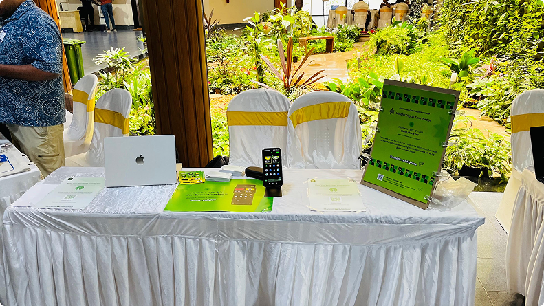
THE MONTHLY BOOTH · IIT MADRAS
So why revamp now?
Because we sat with it for a while, and “just ship an update” started to feel like a lie. We didn't want to add a feature and call it a release. We decided to revamp the whole thing and make it the best product we've ever built.
The honest reason is this. We are up against an entire generation of the smartest people alive who spend their working lives making sure you stay hooked. That's not me being dramatic, it's a job description. There are teams and budgets and roadmaps dedicated to keeping your attention exactly where it is right now.
There's even a documented method for it. Nir Eyal wrote the book. It's literally called Hooked.
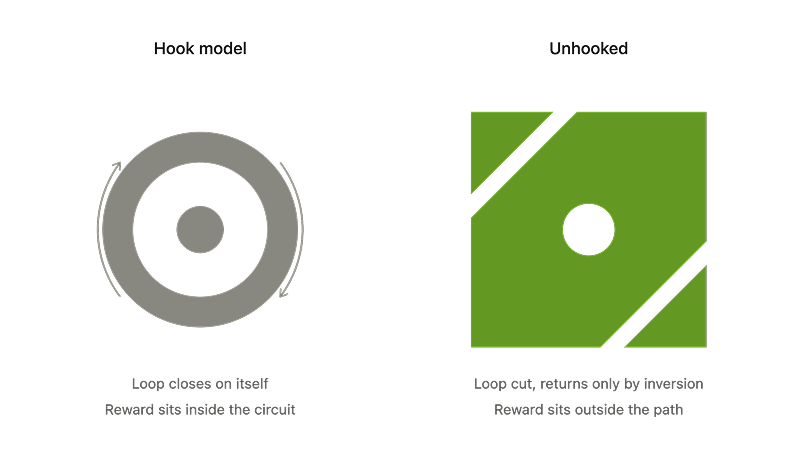
THE LOOP, CUT OPEN. THE REWARD MOVES OUTSIDE THE PATH.
“It's that damn phone.”
Trust me bro. She was right. If ZenMode helps even a million people on this earth build a healthier relationship with their smartphone and their time, I think our purpose is done. At least with ZenMode. Lol.
Back to the topic, the design system
Right. This is what the prayer was actually for.
Here's my fear: that ZenMode ends up as just another open source product sitting in a list on F-Droid. Another repo. Another entry that nobody opens twice.
I heartfully believe this is going to impact millions of lives. And a product that believes that about itself can't look like an afterthought. The design system isn't decoration, it's the part that decides whether anyone takes the idea seriously enough to let it into their day.
So that's what I'm building next.
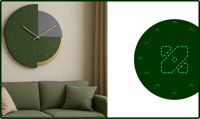

OBJECTS AND STICKERS · MINIMAL BASE, VIBEY SKEUOMORPHISM AS THE TEXTURE.
What I'm chasing in the revamp
A few notes from the same park bench, unfiltered.
Vibey. Excitement.
A rewarding experience, not a scolding one.
Minimal base, vibey skeuomorphism
Not flat, not nostalgia cosplay. Something that can live for years.
Buried for the patient
Small things for people who stay long enough to find them. Long run rewards, not dopamine crumbs.
Open source, all the way down
No dark patterns to hide, so nothing to hide.
Obviously.
Non-negotiable.
What is the one thing ZenMode does?
Not ten things. One.
The craft
The brand style itself, and the reasoning under every decision. Core, score, mark, colour, type, icons. Nothing here is decoration.
conjunction · although, though
Smartphones are addictive, Albeit we make it “Zen.”
One thing, and one thing only.
To help people reduce unintentional and meaningless phone use by creating an environment that makes intentional use easier, while providing accountability and rewards for healthier behaviour.
People don't need to abandon their phones. They need a better relationship with them.
ZenMode turns mindless phone use into intentional engagement through mindfulness, accountability and positive rewards.
Make the healthier choice easier than the impulsive one.
Eliminate screen time.
Make people use their phones as little as possible.
Shame users for using their phones.
Treat every minute of screen time as bad.
Block technology and disconnect people from the digital world.
Become another strict detox or screen-time blocker.
Reduce unintentional usage.
Reduce meaningless usage.
Increase intentional usage.
Make the healthier choice easier than the impulsive choice.
Create accountability without guilt.
Reward meaningful behaviour instead of only punishing bad behaviour.
Zen Score.
If the USP is accountability and reward, the product needs one number that can go up. Not a timer counting down on you, a score you earn back.
Up 0.6 from yesterday. A mindful day: 7 or more.
PARTNER SEES THE SCORE. NOT THE SHAME.
The score, in one line
A score out of 10, to one decimal. Three quarters is screen time against the daily promise you set; one quarter is session quality, where calm, intentional use counts fully. Seven or more is a mindful day.
Pickups with no intent set. Sessions past the length you asked for. Apps you yourself tagged as unintentional.
Declared sessions that end on time. Productive-app time. Streaks of days where intent matched behaviour.
One card at the end of the day. Every deduction and every gain, itemised, with the minutes attached. No graphs you can't act on. The report is what your accountability partner receives, the number, the direction, and nothing else.
A square, one cut, one dot.
100×100. An 8px diagonal cut at 45°. Every corner rounded to the same 8px. The dot is 12px, and it sits in the gap the cut created.
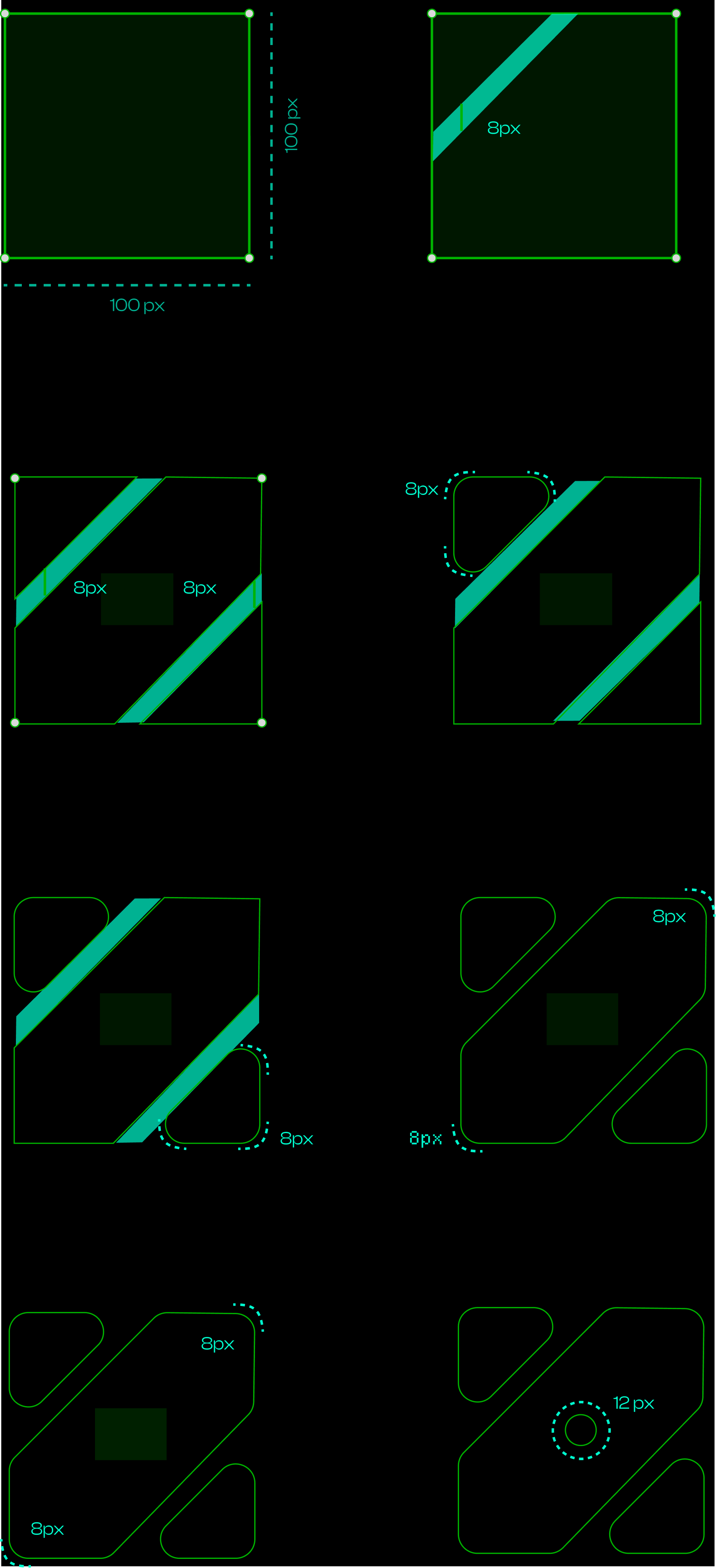
The cut runs corner to corner, so the two counters and the diagonal resolve into a Z before you're told to look for one.
The motion primitive of the brand. One mark, rotated 90° twice, becomes Z → E → N. Every loader, splash and reward animation is that same rotation, never a new shape.
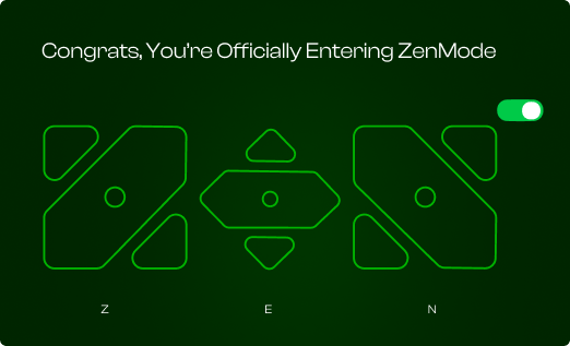
Same topology, one cut. The Hook is a ring, a continuous path where the end feeds the start. Slide a diagonal through that ring and you get exactly this mark: two counters that no longer connect. The logo isn't a shape invented next to the Hook Model. It's the Hook Model with the return severed. That's the thesis, drawn.
The counters still mirror. They sit at 180°. The form repeats, it just can't cycle. Repetition without capture.
The dot changed sides. In the Hook it's inside the loop, powering the return. In the mark it's in the gap the cut created, touching nothing, load-bearing on nothing. The return isn't produced by the system. It's what the system clears room for.
The long diagonal is the long needle, the minute hand mid sweep. The two chunks above and below it are the short hands, the little arrows pointing away from each other. Read it that way and the mark stops being a letter and becomes the thing the whole product is about, which is your time.
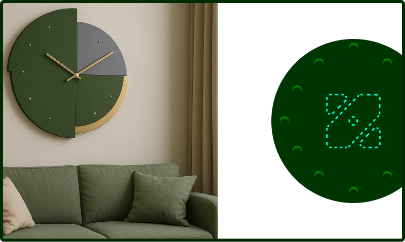
Four readings, one shape, and we honestly did not plan three of them. If you see a fifth thing in there, tell us. We will put the best one in the docs and credit you, even if it is a slice of pizza.
Green does the work. Orange and yellow do the reward.
Every ratio below is measured against the surface it's paired with. Anything under 4.5:1 is labelled and restricted, nothing in that group is ever allowed to carry body copy.
Used on the OS wordmark, the score bar, streak rings and reward moments. Never behind text, never as a page background. On dark surfaces only, so the yellow keeps its 9.5:1.
Three layers. Each one has a job.
Headlines, hero statements, the wordmark. Medium 500 only. Never below 20sp, never for a paragraph.
Every UI string in the launcher: titles, body, buttons, settings, empty states. 400 and 600 only.
Zen Score, timers, deltas, mono labels. Tabular by default so digits never jump while a session runs.
Android scale in sp, dp and tracking
Sizes in sp so they respect the user's font-size setting; layout in dp on a 4dp grid. Line height is a multiple of 4. Every scale step survives a 200% font-scale without clipping because no container has a fixed height.
20dp screen margin. 16dp card padding, 20dp on the score card. 12dp between list rows, 24dp between groups.
48dp minimum touch target, 8dp minimum gap between two targets. Body copy caps at 60 characters, on a 360dp screen that lands at 16sp with 20dp margins.
Clash tightens as it grows: -0.01em at 24sp down to -0.02em at 57sp. Geist stays near zero and opens up slightly below 16sp. Departure Mono never goes negative, the mono grid is the point.
Coloured glyphs, brand green, one weight.
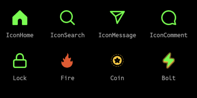
24dp box, 2dp stroke, 8dp corner radius to match the mark. Green #5BDF62 on dark, #0F7A18 on paper. Outline by default, filled only for the active tab.
Streak, coin and bolt are the only icons allowed to leave green, ember and amber, filled, with the soft inner highlight. They appear when something is earned, never in navigation.
Never two accent colours in one glyph. Never an icon alone as a touch target under 48dp. Never red for a deduction, deductions are ember, because a deduction is information, not a punishment.
Raw pages, ugly first drafts, all of it.
I'll doodle, brainstorm and post the updates in the coming sessions. If you want to help us build an addiction free earth, we're on a mission and the door is open.
Cute little things you'll want on a laptop.
 unhooked
Z → E → N
open source, all the way down
REWARD, NOT SHAME
unhooked
Z → E → N
open source, all the way down
REWARD, NOT SHAME
DIE-CUT, 5PX WHITE BLEED, MATTE. ONE PER BOOTH VISITOR.